Then I worked intensely for a few weeks to establish new website.
This time I focused on larger images, hopefully for your enjoyment. I have also worked hard to get this to work well across multiple browsers iOS, Android, Internet Explorer, Opera, Chrome, and small and large screens.
The main elements of the website's portfolio viewing with selected images, photo archive with search and acquisition opportunities and Blog.
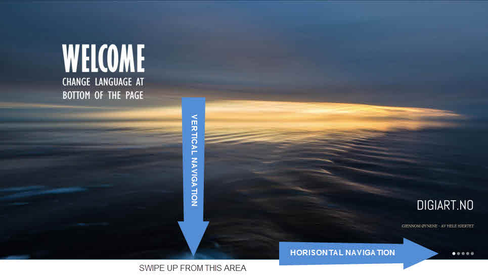
PICTURE 1 – from the home page you can navigate horizontally and vertically.
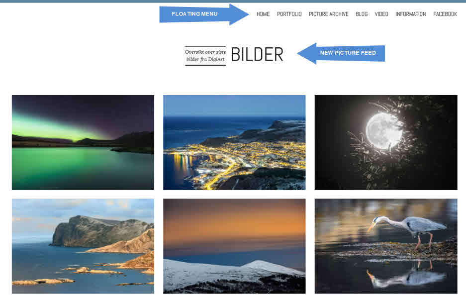
PICTURE 2 – On the main page you have quick access to a floating menu, and an overview of the 6 latest pictures. Further down the page you will also find blog, as well as information about what DigiArt offer.
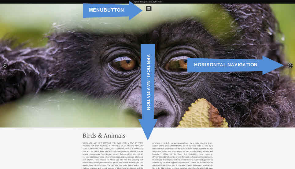
PICTURE 3 – On the Portfolio page you can also navigate horizontally and vertically. Horizontal to change the category, and vertically to view images. You always have access to a neutral menu at the top of the page.
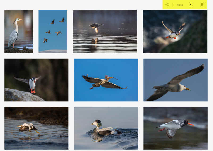
PICTURE 4 – On top of the Portfolio gallery is a neutral menu of tools for sharing to social media, and selection for larger photos with descriptions. You can also click once on a picture to choose larger images with descriptions, and click once on a picture for full screen viewing and slide show.
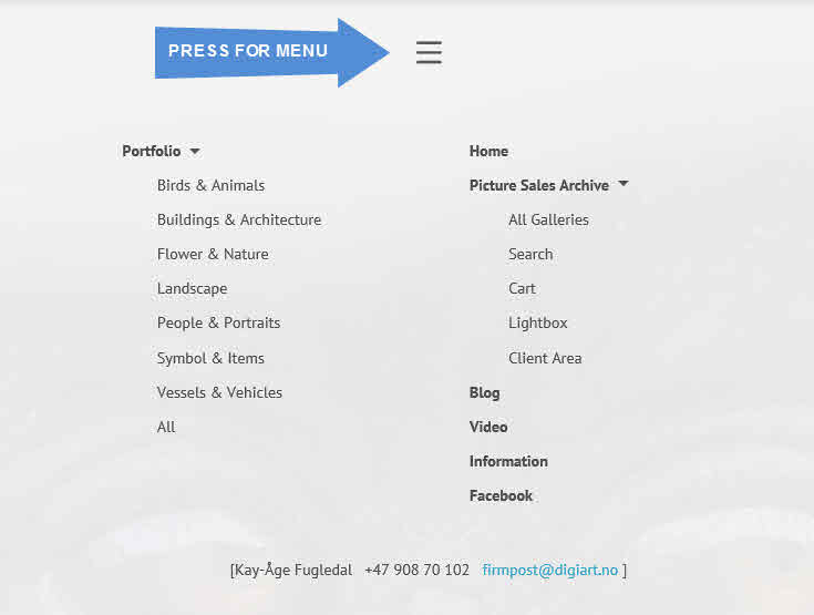
Photo 5 – Discreet and easy menu.
Feel also free to visit my portfolio, or choose from the shortcuts located in the right section of this page. Feel also free to subscribe to my blog, and to share, comment and like my photos by using the social tools on my site.
DigiArt can be found on Facebook here; http://www.facebook.com/DigiArt.no


